Applications of control charts in the molecular lab

In this month’s installment of The Primer, we’re going to touch on a topic which applies to all clinical laboratories running analytical assays (molecular or otherwise), is almost certainly in use in your lab, and will be intimately familiar to some readers. However, while everyone in the lab relies on the use of control charts as part of routine quality control (QC), not everyone is familiar with those charts and the concepts that underlie them. So, for the benefit of laboratorians who don’t mumble “Levey-Jennings” in their sleep, we’ll summarize key concepts here. They are important to understand, and understanding them can give laboratorians added confidence in results reported by their lab—and, perhaps, a new appreciation for some of the unsung, behind-the-scenes work that is required to ensure accurate results.
One inescapable aspect of QC is dealing with problems that have already occurred: finding the root cause, preparing Corrective and Preventative Actions, implementing changes as needed, and examining outcomes to see that the problem will not recur. Another, preferred, aspect is the detection and resolution of nascent problems before they materially impact results. One primary way by which a QC system as applied in an MDx lab can head off problems before they impact results is through the application of control charts.
Levey-Jennings basics
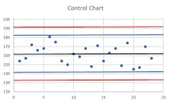
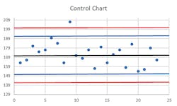
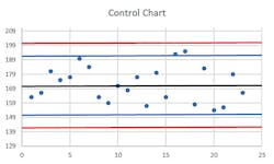
The usual control chart situation can be applied in the case of an assay with a quantified result, and one or more in-assay control samples which are run on a regular basis. Also known as a Levey-Jennings chart, this is prepared by conducting a number of per-protocol runs of the assay (normally, to provide a minimum of 20 replicate measurements for each control material, over a period of at least 10 days, and ideally with different operators). From this data set, the mean and standard deviation (“SD” in many applications, but here commonly just “s”) of the control values are calculated and form the basis of setting boundaries. This is generally plotted as the control mean (a line across the middle of the chart), with horizontal lines above and below this indicating the +/- 2s and +/- 3s boundaries. Individual run control values are plotted as they occur along the X axis, providing a “running commentary” over time of the assay performance.
Due to normal stochastic variation in any assay, these control values should be expected to plot most of the time a little above or below the mean, with less frequent outliers. Usually, this is done in conjunction with what’s called the Westgard Rules, which are a convention that an instrument run and all its results should be scrutinized if any one control exceeds 2s from the mean (known as a 1(2s) violation). If it’s actually a > 3s variation (a 1(3s) violation), then that’s taken as reason to reject the run. If it’s between 2s and 3s but this appears to be a repeat pattern—that is, two consecutive control values on runs exceed 2s in the same direction, or what’s referred to as a 2(2s) violation—the run results should be rejected. Other multirules include one that says within a single run, if there are duplicate controls and they each diverge by 2s in opposite directions from the mean, that’s known as an R(4s) violation.
Four consecutive runs with controls exceeding 1s is a 4(1s) violation; 10 consecutive controls all on the same side of the mean, even if not exceeding the 1s boundary, is a 10x violation. Each of those violations can be set as a basis for run rejection. See Figures 1, 2, and 3 for some examples.
Rules and guidelines
Think that’s it for the rules? Think again! Actually, perhaps they should be called the “Westgard Guidelines,” not “Rules,” because not every lab applies the same rules; depending on the particular assay and validation data, different risk balances between false error flags (rejecting runs which were actually OK and within reasonably expected variation) and need for stringent error detection can lead to slightly different rule applications. Some of these other rules include 8x or 12x (similar to 10x but with different consecutive samples required); 2 of 3(2s) is when any two out of three consecutive values exceed 2s in the same direction; 3(1s) is when three consecutive controls all exceed 1s in same direction. A 7T violation is when seven consecutive control values provide a clear trend either up or down from mean. We’ll stop our list of rules there even though that’s not all you might find in use; it’s enough to give the flavor of how these rules are defined and applied.
Does application of this process mean that every rejected run was actually in error? No, not necessarily, particularly if the most stringent of the rules are applied; normal statistical variation can lead to a small fraction of tests naturally falling outside of narrow boundaries.
That’s the inherent nature of “standard deviation.” However, application of appropriately risk-selected versions of these rules can minimize unwarranted assay rejections, making them a rare occurrence, while actively intercepting runs on which actual problematic deviations have occurred. Properly set, these rules allow for detection and remediation of problems with equipment, protocols, or reagents before material validity of test results is impacted. The simplest example of this is probably that embodied by the 7T rule. It’s not hard to imagine this scenario arising, for instance, due to degradation of an assay reagent, and to see how the use of control charts would allow the detection of this trend, possibly even before any significant impacts on assay sensitivity have occurred. This is a “win” for the QC system: heading off a problem before it occurs.
What about qualitative assays: is there a way to do something similar there? Yes, there is, although it’s perhaps a bit more complex in that the qualitative data needs to be made quantitative in some way. For instance, if one were to run a qualitative PCR assay with a “low positive” control, it should by definition have a low but finite negative rate (e.g., five percent).
A single rare negative result on this control is thus to be expected; but two in succession, or even two out of 20, would be cause for concern. Similarly, it’s possible to quantify some aspect of an inherently qualitative assay, such as signal intensity of a +/- signal control. While assay interpretation would only require that the signal intensity be above a preset positivity threshold, if there is some measure of this intensity and it begins to clearly deviate from normal values, something is probably amiss. The exact form of application of control chart measures to a qualitative assay would depend on the particulars of the assay, but these examples should help the reader to appreciate that it is both possible and useful in this context as well.
Other variations on control charts exist, and for each variation there can be statistically derived, risk-weighted rejection rules; however, in our limited space here, we’ll leave these to readers looking to delve deeper into the subject (likely in their own particular context). The examples given here are the most common types encountered, and should illuminate the logic of similar rules in other settings.
Satisfying the suits
Finally, control charts can be of some help in meeting an external challenge that is sometimes faced by lab directors with regard to QC functions in large organizations—that is, in justifying QC process expenditures to the financial and business leaders of the organization. When a finely functioning QC system prevents problems before they occur, the lab is challenged to firmly state, “During the past time period, QC system processes avoided X problems with an aggregate cost of $Y.” To the bean counters, particularly if they don’t understand what goes on in a lab very well, there’s the appearance of an investment with an unquantified return. Labs sometimes find themselves in the position of having to defend spending money on QC simply because it is working so well!
For the most part, strict regulatory systems with routine inspections and accreditation requirements ensure that the question, “Why are we spending this money on QC, when we didn’t have any problems?” is not overtly voiced. However, this doesn’t mean the question isn’t perhaps present in the minds of administrators responsible for cost-effectiveness. By considering control chart “captures” of rejected instrument runs as avoided errors, however, lab leaders are able to start placing a more finite value on active QC processes and show that the errors avoided are not purely hypothetical. Coupled with estimates of what release of these potentially erroneous test results would cost, projected return on investment (ROI) values can be calculated, and the value of the QC system becomes apparent in quantifiable metrics familiar to business operations.
As I hope the above discussion demonstrates, ensuring accuracy of lab results through stringent QC is of paramount importance. It also suggests why sometimes result reporting can be delayed: it may sometimes be necessary to repeat assays when flags of this nature cause rejection of a run despite the best of processes.
John Brunstein, PhD, is a member of the MLO Editorial Advisory Board. He serves as President and Chief Science Officer for British Columbia-based PathoID, Inc., which provides consulting for development and validation of molecular assays.
About the Author

John Brunstein, PhD
is a member of the MLO Editorial Advisory Board. He serves as President and Chief Science Officer for British Columbia-based PathoID, Inc., which provides consulting for development and validation of molecular assays.