Interpretation of qPCR curve shapes
In this month’s examination of topics of interest in the molecular diagnostic laboratory, we’re going to look at the workhorse of many singleplex or low-plexity multiplex methods—real-time polymerase chain reaction (PCR)—and consider what sort of information we can glean from the shape of the amplification curve. The observations we will consider are equally valid for both probe-based and binding dye-based real-time methods, and, as we’ll discover below, can provide a remarkable degree of insight into what might be happening in the reaction well.
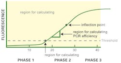
Let’s start by considering the classical, “normal” qPCR amplification curve shape as shown in Figure 1. As generally plotted, this is a sigmoidal shape with what we’ll refer to as three visually distinct apparent phases or regions. The first phase (up to about Cycle 15 or so in Figure 1) is near the baseline with a slow upward trend in the line. The second phase is a strong upward swing in the line, between roughly Cycle 15 and Cycle 30 of our imaginary data figure. Finally, the third phase, from about Cycle 30 onward, is a plateau where the amplification signal tapers off and ceases to grow.
Two points on the curve are of particular interest to us. One is the CT value; although exact definition of this depends on the instrument software algorithms, this is basically the point where the curve first clearly rises off baseline to a statistically significant degree. (Depending on your instrument and software, this may alternatively be referred to as CP). The crossing of this statistical noise threshold is the basis for calling a sample positive in a qualitative assay, and the cycle number at which it occurs is the basis for generation of a standard curve and quantitation of starting template in a quantitative PCR. The second point—not particularly of interest in the daily clinical lab, but of relevance here—is a point midway up the apparent “second phase” of the curve, where there is an imperceptible change from the curve increasing in slope each cycle, to decreasing in slope each cycle, or what a mathematician would refer to as an inflection point.
Next, it’s important to appreciate that the amplification curve shown on your screen is not (generally) raw data. It’s been processed through the instrument software to apply fluorophore-specific channel filters or compensation and to remove background noise, and possibly subjected to smoothing algorithms. Vertical axes are most commonly not total fluorescence but per-cycle change in fluorescence. In fact, if you can look at pure raw fluorescence versus cycle data (and on most systems, there are ways to do this), the data won’t look very much like our nice sigmoidal curve. The various processing done to the raw data to make our traditional curve helps make it more readily interpretable, but needs to be borne in mind as in some cases it can lead to erroneous conclusions.
With all that in mind, let’s think about what causes the processed curve to have the characteristic shape of Figure 1. The first apparent phase—little or no signal—primarily arises due to limits of instrument sensitivity. Even in a hypothetical perfect PCR reaction with perfect two-fold amplification per cycle starting from a single template copy, the instruments just can’t “see” the fluorescent signal from the amplification until it reaches a certain level. This doesn’t mean there isn’t background fluorescent signal being detected in these early cycles; there is, and it fluctuates around, but the “true” product signal is an insignificantly small component of this signal.
This background noise is actually useful; in many instruments, measurement of this is used to set the CT threshold as some statistically relevant increase out of the noise range. (That is, any signal far enough above this level of signal is taken as coming from amplicon.) We therefore expect this early cycle phase to essentially be “flat” in our amplification curve, and in some systems, we apply this expectation as a tool: any small drift trend in the background noise is assumed to be due to changes in the fluorophores themselves (decay of reporters or quenchers due to thermal cycling). Background subtraction algorithms generally act to ensure this early phase of the amplification curve thus looks flat. Some even go so far as to actively correct for any trends in signal detected in this stage, adding or subtracting this amount to “flatten” the early curve region.
The second apparent phase occurs when the amplicon-derived fluorescent signal actually gets strong enough to be reliably detected by the instrument. At some early point of this, the CT value is crossed, and our assay scores positive (and we get a cycle CT number useful for quantitation, if desired). The PCR process is a twofold per cycle; exponential growth and the detection of this leads to a strong, straight “curve growth” phase in most common amplification plot forms.
Just as in any economy however, utilization of limited resources (the primers, nucleotides, and even enzyme activity available) in the reaction vessel eventually starts to limit growth; the PCR can no longer work to its theoretical maximum resource-unlimited efficiency (whatever that is; a perfect 2.0 per cycle, or something less). This point where resource limitation first takes hold, slowly, is our inflection point noted above; and as resource limitation becomes progressively more severe, the amplification curve tails off and finally plateaus in our third phase, effectively resource-exhausted and unable to grow further.
A PCR amplification curve which looks like Figure 1 is generally a sign of a “healthy,” good PCR reaction. As a direct measure of that, we could actually go in and measure the slope of our curve during the early (pre-inflection point) part of the second curve phase. Depending on the exact form of curve axis, different math is performed, but the result is a measurement of “N” in the equation N^(cycle number), where a perfectly efficient PVR has N=2 (doubling each cycle); real-world good assays generally fall in the N>1.9 range. Many software packages can directly provide the user with N for a given PCR assay, either off a single curve (as described here) or off a standard dilution curve.
The second measure we can take from a healthy amplification curve is the CT value as discussed above, or in effect how late in cycling the phase 2 region starts. We must not of course assign any correlation between the fluorescence value in the phase 3 plateau area and starting template concentration. (If your author has belabored this point over the course of three years of this series, it’s because it continues to be an all-too-common misconception!)
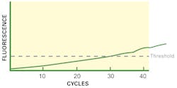
While knowing the exact slope number is useful (if you find that it is 1.6, your assay needs optimization of conditions), even a “by-eye” comparison of the curve shape is useful. If your curve has a weak (low slope) or even indistinguishable phase 2 like our Figure 2, something is not right. If this is a general observation of your assay on clean standard materials, then a first thing to consider would be the Tm value of the cycling. If this is too high, your amplifying primers can’t bind down on their priming sites as effectively as possible, reducing your maximal per-cycle efficiency and leading to a “slow” (low slope) phase 2 area. If this is a one-off observation on a single sample, and your control material shows a “strong” (steep slope) phase 2 by comparison, then it’s more likely you have an instance of sample-specific PCR inhibition, at a level high enough to interfere with efficiency (meaning any quantitation data you try to interpret from the CT on that sample is probably wrong, with a later CT than expected) but obviously not at a high enough level to yield a completely negative result.
A similar curve can occur as well for very different reasons. If your PCR primers have very poor specificity (possibly due to too low Tm, allowing them to bind indiscriminately), then it can be possible to simultaneously have many different “random” amplicons of varying efficiencies all being made at once in the reaction. This competition between reactions, and their individually hitting different reaction “phases” at different times, leads to a curve shape more like Figure 2, as their aggregate fluorescent signals drown out distinct phase 2 and phase 3 regions. (Note that in most cases, this would be a potential observation in binding dye-based assays, which, unlike probe-based assays, are not specific in signalling only signal from desired target sequences; this is one of the significant reasons for preference of probe-based assays over binding dye-based, as this type of error is effectively “swept under the carpet.” In some unfortunate cases, though, side products may have enough sequence homology to probes to give rise to signal; so this sort of observation can occur, albeit less frequently, in probe-based assays. Thus, regardless of methodology, the validity of interpreting an amplification curve with a feeble phase 2 region should be eyed with some suspicion.)
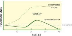
Finally, what about the curve shape as shown in Figure 3? While it may at first appear to be bizarre, this not infrequently encountered curve shape actually is highly distinctive of a very specific reaction situation: when particular software algorithms are being applied. While this curve ends up below the CT threshold and one might be tempted to call the reaction negative, in fact the exact opposite is true: this curve is arising due to an extremely high starting target template concentration.
Recall from above that some software force the phase 1 region to appear flat, by adding or subtracting any curve trends detected in early cycles on the assumption these arise from background changes to fluorophores and that all early cycle signal is noise. If instead, the reaction starts with such a high template load as to already have detectable real signal in these early cycles (that is, the assay has effectively passed a real CT in a very early cycle), then these background correction algorithms now are removing real, target-derived signal.
This subtraction of a real signal has the graphical result of effectively rotating the amplification curve about the axis origin. Phase 1, which should slope upward, now looks flat or even slightly decreasing. Phase 2 appears, but since its actual rate of growth is underreported, it looks “weak” and may in some cases fail to cross the CT line. Finally, phase 3, where an actual plateau occurs, now looks like a negative slope region, since no growth minus a growing “background” yields a negative value.
While this amplification curve shape alone is nearly definitive, if the instrument software being used sets reaction-specific CT values, a second hint that this is occurring is when the CT threshold is very high compared to controls or other well-behaved samples; that is, the ‘background’ signals are much higher than normal. Fortunately, if this readily distinguishable curve shape is observed, proving the root cause is readily done by repeating the test on a greatly diluted sample (1/10,000 would be a reasonable choice). Alternatively, some software packages allow the user to go in and manually switch off background correction; doing so in this case immediately provides a “true” amplification curve (represented as Figure 3, uncorrected line). Note that valid CT values for quantitation are, however, achievable only through dilution and retesting; but for a purely qualitative result, disabling background correction may be sufficient for appropriate result calling.
While the above constitute only a small subset of some of the things real-time PCR amplification curves can tell us, it’s hoped this review has been informative and piqued the reader’s interest. If so, it can be highly educational to take a real-time PCR run data set and (where supported by the particular software), experiment with changing the background correction parameters (start and end cycles, or backgrounding on or off altogether) as well as curve smoothing options such as boxcar averaging, and seeing what effects these have on the displayed curve shapes. The familiarity arising from this can be useful in troubleshooting the next time an unusual qPCR amplification curve arises—and chances are, that’s not too far in your future.
John Brunstein, PhD, is a member of the MLO Editorial Advisory Board. He serves as President and Chief Science Officer for British Columbia-based PathoID, Inc., which provides consulting for development and validation of molecular assays.


